Visualizing DNS Query Entropy via a Scatterplot Graph (DNS - Part 4)
Hi !
I recently discussed the use of entropy in relation to DNS queries and the benefits of calculating it.
Today’s topic will be to present a way to visualize these queries.
First, I need a script that will build a reduced version of dns.log and aggregate the result into a file that will represent the day.
- This is simpler than working with dns.log files that are rotated hourly.
- Please note that this file needs deleted at midnight.
/usr/bin/awk -F'\t' '/^[^#]/ {print $1 "," $3 "," $10}' dns.log >> zeek_dns_reduced_output.csv
Now the R script that will analyze the data.
#!/usr/local/bin/Rscript
# We need this one, one of my favorites
library(tidyverse)
# Definition of a function to calculate the entropy of the chain passed as a parameter
F_calc_entropy <- function(input_string) {
# If nothing, return
if (is.na(input_string) || input_string == "") return(0)
# We split 'input_string'
chars <- strsplit(input_string, "")[[1]]
# Calculating the frequencies of each character
p <- table(chars) / length(chars)
# Shannon's formula
-sum(p * log2(p))
}
# Definition of a function to do the main job
F_analyse_dns_data <- function() {
# Reading a reduced version of dns.log. We skip lines beginning with '#'
dns_data <- read_delim("zeek_dns_reduced_output.csv", delim = ",", comment = "#",
col_names = c("ts", "id.orig_h", "query"))
# Calculating entropy for each query
# We do some checks, remove useless queries then apply the function 'F_calc_entropy()' on each good queries
dns_analysis <- dns_data %>%
filter(!is.na(query)) %>%
filter(!grepl("in-addr|\\(empty\\)",query, ignore.case = TRUE)) %>%
mutate(
# zeek timestamp conversion ('ts' uses seconds in Zeek)
datetime = as.POSIXct(ts, origin = "1970-01-01", tz = ""),
# Calculating the minutes elapsed since midnight
minutes_since_minuit = (as.numeric(format(datetime, "%H")) * 60) +
(as.numeric(format(datetime, "%M"))),
entropy = sapply(query, F_calc_entropy)) %>%
select(ts, minutes_since_minuit, id.orig_h, query, entropy)
# We create the graph
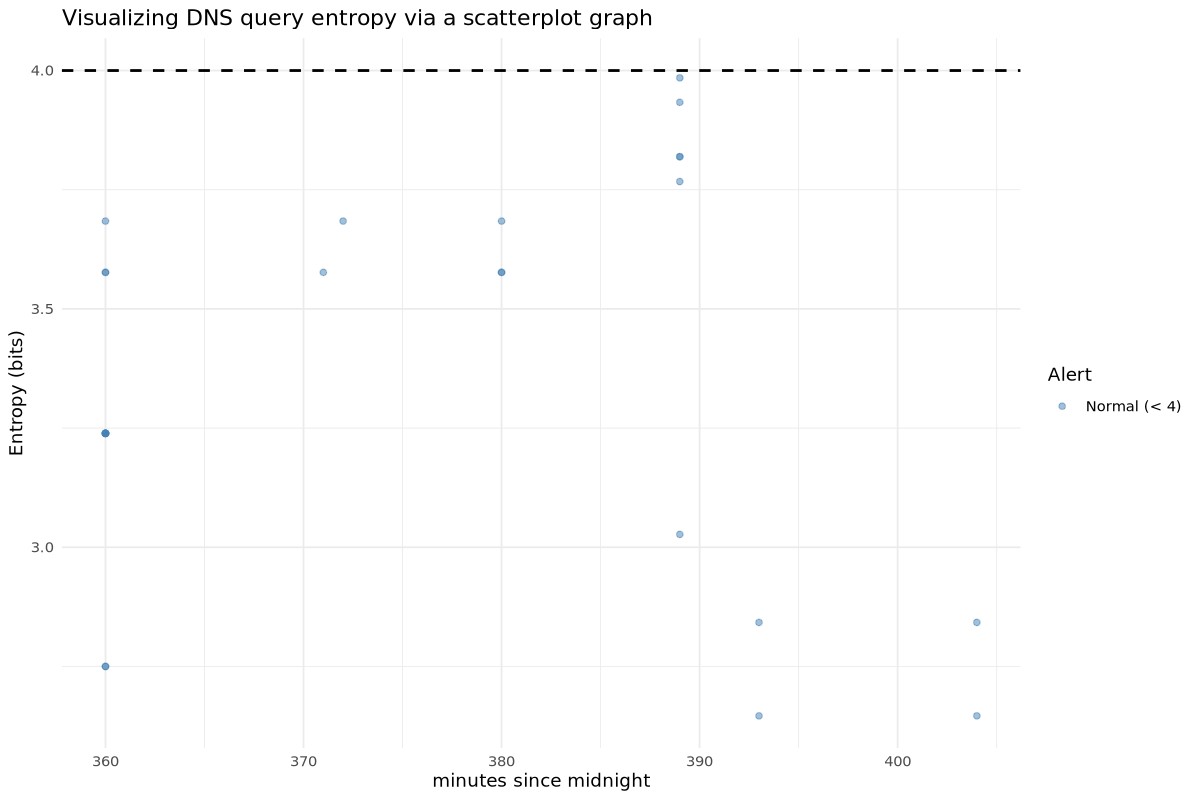
mygraph <- ggplot(dns_analysis, aes(x = minutes_depuis_minuit, y = entropy)) +
# Conditional coloring : 'red' if entropy is > 4, else 'blue'
geom_point(aes(color = entropy > 4.0), alpha = 0.5) +
scale_color_manual(values = c("steelblue", "firebrick"),
name = "Alert",
labels = c("Normal (< 4)", "Suspect (> 4)")) +
geom_hline(yintercept = 4.0, linetype = "dashed", color = "black", linewidth = 0.8) +
theme_minimal() +
labs(
title = "Visualizing DNS query entropy via a scatterplot graph",
x = "minutes since midnight",
y = "Entropy (bits)"
)
# Making JPG image
jpeg("analyse_dns_entropie-scatter.jpg", width = 1200, height = 800, res = 120, quality = 90)
print(mygraph)
# Closing the graphics device
dev.off()
}
# calling the main function
F_analyse_dns_data()
And now the graph that represents all of this.
Cheers.