Visualizing DNS Query Entropy via a Density Graph (DNS - Part 5)
Hi !
I recently discussed the use of entropy in relation to DNS queries and the benefits of calculating it. I will continue to present ways to visualize the entropy of DNS queries, this time using the concept of density.
- What are we talking about ?
In the context of data visualization and R, density refers to a Kernel Density Estimation (KDE). It is a way to estimate the probability density function of a continuous variable.
-
Here is how to understand it conceptually:
-
The “Smoothed Histogram” Analogy
Think of a density plot as a smoothed version of a histogram. While a histogram groups data into discrete “bins” (which can look jagged),geom_density()creates a fluid curve. This curve helps you see the “shape” of the data distribution without being distracted by the arbitrary boundaries of histogram bars. -
Area Under the Curve = 1
This is the most important mathematical property. In a standard histogram, the y-axis often represents the count (frequency). In a density plot, the y-axis represents density.- The total area under the entire curve is always equal to 1 (representing 100% of the data).
- This means that the height of the curve doesn’t tell you the “count” of points, but rather how concentrated the points are at that specific value.
-
-
How it is calculated To create the curve, R performs a specific process:
- Kernels: It places a small “hump” (usually a Gaussian/Normal curve) over every single data point in your CSV.
- Summation: It adds all these individual humps together.
- Result: Where many data points are close together, the humps stack up, creating a high peak. Where data points are sparse, the curve stays low.
-
The “Bandwidth” (The Smoothing Factor) The “smoothness” of the curve is controlled by a parameter called bandwidth (
bw).- Small bandwidth: The curve is very wiggly and follows every individual data point. It might show too much “noise.”
- Large bandwidth: The curve is very smooth. It shows the general trend but might hide small clusters of anomalies.
-
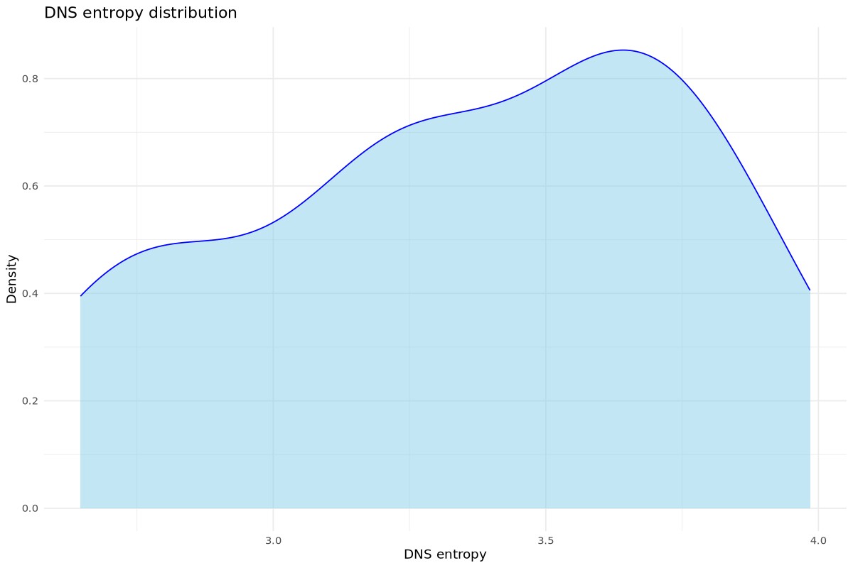
Why this is useful for your DNS Entropy: If your DNS entropy density plot has a “long tail” to the right, it means you have a few rare events with very high entropy. These are your potential anomalies. If you see two peaks (bimodal), it suggests your network has two distinct types of traffic (e.g., standard web browsing vs. automated background services).
Once these concepts have been explained, let’s move on to the visualization part.
First, as previoulsy, I need a script that will build a reduced version of “dns.log” (the file created by Zeek) and aggregate the result into a file that will represent the day. As a result, I will be working with DNS data reduced to the needs of the R script.
- This is simpler than working with “dns.log” files that are rotated hourly.
- Please note that this file needs deleted at midnight.
/usr/bin/awk -F'\t' '/^[^#]/ {print $1 "," $3 "," $10}' dns.log >> zeek_dns_reduced_output.csv
Now the R script. For explanations regarding the lines, please refer to the following blog post: Visualizing DNS Query Entropy via a Scatterplot Graph.
#!/usr/local/bin/Rscript

if (!require("ggplot2")) install.packages("ggplot2")
if (!require("tidyverse")) install.packages("tidyverse")

library(ggplot2)
library(tidyverse)

F_calc_entropy <- function(input_string) {
  if (is.na(input_string) || input_string == "") return(0)

  # We split 'input_string'
  chars <- strsplit(input_string, "")[[1]]
  # Calculating the frequencies of each character
  p <- table(chars) / length(chars)
  # Shannon's formula
  -sum(p * log2(p))
}

F_read_csv_file <- function() {

    # Reading 'dns.log'. We skip lines beginning with '#'
    dns_data <<- read_delim("zeek_dns_reduced_output.csv", delim = ",", comment = "#",
    col_names = c("ts", "id.orig_h", "query"))
}

F_analyse_dns_data_density <- function() {

    dns_analysis <- dns_data %>%
      filter(!is.na(query)) %>%
      filter(!grepl("in-addr|\\(empty\\)",query, ignore.case = TRUE)) %>%
      mutate(
          datetime = as.POSIXct(ts, origin = "1970-01-01", tz = ""),
          minutes_depuis_minuit = (as.numeric(format(datetime, "%H")) * 60) +
                                  (as.numeric(format(datetime, "%M"))),
          entropy = sapply(query, F_calc_entropy)) %>%
          select(ts, minutes_depuis_minuit, id.orig_h, query, entropy)

    # This tells R to use the dns_analysis data frame,
    # maps the entropy column to the x-axis and adds the "geometry" layer
    # for a density plot (a smoothed version of a histogram).
    mygraph <- ggplot(dns_analysis, aes(x = entropy)) +
                 geom_density(fill = "skyblue", alpha = 0.5, color = "blue") +
                 labs(title = "DNS entropy distribution",
                          x = "DNS entropy",
                          y = "Density") +
                 theme_minimal()
    # Making an image
    jpeg("dns_entropy-density.jpg", width = 1200, height = 800, res = 120, quality = 90)
    print(mygraph)
    dev.off()
}

# Calling the function
F_analyse_dns_data_density()
And now the graph that represents all of this.
Cheers.